
Without further ado, here it is:
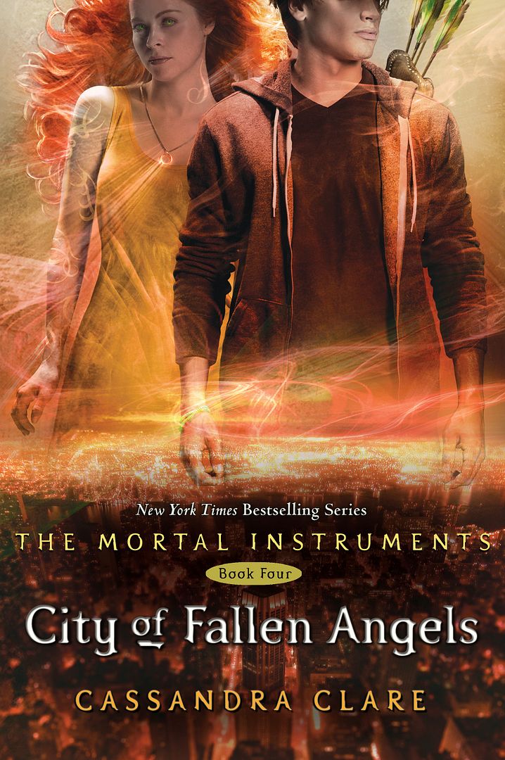
I... I'm not sure if I like it. *Cries*. The bottom part is gorgeous, and matches up with the rest of the books really well. Plus, the swirls and patterns are stunning, but I don't like seeing Clary's face. It just doesn't seem right to me that her face is in full view, whereas on the previous covers the faces have been half chopped off.
And the model for Clary looks really old as well. Couldn't they have found a younger one? I love her hair though! It's so pretty.
Overall, I'm not a fan. But who cares about the cover? I think this is one book/series I will make an exception for. I refuse to judge this book by it's cover because I know it's going to be AWESOME!
What do you guys think of the cover?
City of Fallen Angels is going to be released in April, 2011. *Cheers*
